Dialogs
Dialogs are a way to collect user input. There are four different ways you can configure for users to interact with dialogs within Finsemble:Let’s look at each of these in turn.
Use an existing dialog (YesNoDialog or SingleInputDialog)
One easy way to collect information from your users is to use an existing yes/no or single input dialog.
There are several advantages to using these dialogs:
- You don’t have to write code or modify components
- These dialogs cover a wide range of cases
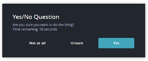
To display a dialog with a question and affirmative, negative and cancel options, run this code in any Finsemble window:
FSBL.Clients.DialogManager.open(
    "YesNoDialog",
    {
        // The title of the dialog
        // title: string, default = "Yes or No Dialog"
        title: "Yes/No Question",

        // The question to present to the user
        // question: string, default = "No question."
        question: "Are you sure you want to do the thing?",

        // The text for the negative response button
        // negativeResponseLabel: string, default = "No"
        negativeResponseLabel: "Not at all",

        // The text for the cancel button
        // cancelResponseLabel: string, default = "Cancel"
        cancelResponseLabel: "Unsure",

        // The text for the affirmative response button
        // affirmativeResponseLabel: string, default = "Yes"
        affirmativeResponseLabel: "Yes",

        // Determines if the negative button should be displayed
        // showNegativeButton: boolean, default = true
        showNegativeButton: true,

        // Determines if the affirmative button should be displayed
        // showAffirmativeButton: boolean, default = true
        showAffirmativeButton: true,

        // Determines if the cancel button should be displayed
        // showCancelButton: boolean, default = true
        showCancelButton: true,

        // Timer
        //
        // The timer will display when both showTimer is true AND timerDuration is a valid
        // number. If the timer expires, the dialog closes and the promise resolves
        // with the value "expired"
        //
        // showTimer: boolean, false
        showTimer: true,

        // The number of milliseconds that this dialog should be displayed
        // timerDuration: number | null, default = null
        timerDuration: 30000
    },
    (err, response) => {
        console.log('response', response);
        // TODO: Switch on response.choice
        // {
        //   value: String,
        //   choice: "affirmative" | "cancel" | "expire" | "negative"
        // }
    }
);
To display a dialog with a question and a single input box, run this code in any Finsemble window:
FSBL.Clients.DialogManager.open(
    "SingleInputDialog",
    {
        // The title for the dialog
        // title: string, default = "Title"
        title: "Single Input Dialog",

        // The text of the question to present the user with
        // inputLabel: string, default = null
        inputLabel: "What is the thing?",

        // The text of the cancel button
        // cancelResponseLabel: string, default = "Cancel"
        cancelResponseLabel: "Unsure",

        // The text of the affirmative button
        // affirmativeResponseLabel: string, default = "Yes"
        affirmativeResponseLabel: "Yes",

        // Determines if the cancel button should be displayed
        // showCancelButton: boolean, default = true
        showCancelButton: true,

        // Determines if the affirmative button should be displayed
        // showAffirmativeButton: boolean, default = true
        showAffirmativeButton: true,

        // Input pattern, used to enforce a regular expression for user input
        //
        // Pattern can be a string representation of a regular expression
        // EXAMPLE: The expression "^[a-z]*$" will accept ONLY lowercase letters
        // EXAMPLE: The expression "[a-z]" will accept any string which CONTAINS lowercase letters
        //
        // inputPattern: string, default = undefined
        inputPattern: undefined,

        // The maximum length of the input
        // inputMaxLength: number | undefined, default = undefined
        inputMaxLength: undefined,

        // The placeholder for the input (this appears in the text field when the dialog is displayed)
        // inputPlaceholder: string, default = "New workspace"
        inputPlaceholder: "Placeholder"
    },
    (err, response) => {
        console.log('response', response);
        // TODO: Process response
        // {
        //   value: String,
        //   choice: "affirmative" | "cancel",
        //   hideModalOnClose: boolean
        // }
        //
    }
);
Use an existing dialog as a template
If an existing dialog doesn’t perfectly meet your needs but it’s close, you can customize it. Here are the advantages:
- Once you implement a template, Finsemble will use your template in all cases of templated dialog from now on. For example: implementing the “YesNoDialog” will result in the templated dialog to be used in every case that the “YesNoDialog” is normally used (that is when confirming exit, saving workspace, and so on).
- You have precise control of look, feel, and functionality of dialog.
Here is an example that we created from a yes/no dialog with an option to cancel:
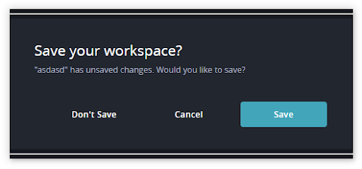
Follow these steps:
Create the template (
YesNoDialogorSingleInputDialog):yarn template YesNoDialogModify the created template (src/YesNoDialog/index.tsx). You can obtain the above screenshot by adding some
elements, like so:
/*!
 * The yes/no dialog is a component that shows the user two options - one to act on a particular option, one to cancel it.
 * Copyright 2017 by ChartIQ, Inc.
 * All rights reserved.
 */

import * from React from "react";
import { createRoot } from "react-dom/client";
import { YesNoDialog, FinsembleCSS, FinsembleProvider } from "@finsemble/finsemble-core";

createRoot(document.getElementsByTagName("div")[0]).render(
    <FinsembleProvider>
        <FinsembleCSS />
        {/* // NOTE: Add an HR element */}
        <hr />
        <YesNoDialog />
        {/* // NOTE: Add an HR element */}
        <hr />
    </FinsembleProvider>,
    document.getElementsByTagName("div")[0]
);
Create a custom dialog
You can use any Finsemble-aware component as a dialog. Here is an example:

Advantages include:
- You can retrofit any existing component to provide dialog functionality
- You can achieve any dialog look, feel, and functionality. You can be as specific as you like.
Here are the steps:
Prepare a component to act as a dialog:
Make sure the component is a singleton.
Set the component
autoShowto false so that it is not visible until shown.Set
launchableByUserto false if you don’t want the component to appear in a Launcher menu.Set the component
spawnOnStartupto true.The component must invoke
FSBL.Clients.DialogManager.registerDialogCallback(callback)exactly once (usually when the component is first spawned - at startup) to set up the callback that will be used to provide data to the dialog.noteIf you reuse the FinsembleDialog UI component as a base for your dialog, this call will be made for you using a callback passed as a prop to it.
The component must indicate that it is ready to be displayed as a dialog by invoking
FSBL.Clients.DialogManager.showDialog()(this is usually invoked in the registered callback).After having been displayed, the component must respond to the opener by invoking
FSBL.Clients.DialogManager.respondToOpener().
You can open the dialog like this:
FSBL.Clients.DialogManager.open(
  // The component name
  "NonDialogComponent",
  {
    // Pass some data, which will be passed as a parameter into the FSBL.Clients.DialogManager.registerDialogCallback
    someData: 12345
  },
  // The response from the dialog received after user interaction
  (err, res) => {
    console.log(err, res);
  }
);
Here is an example of the returned value from the above code:

Here’s the full code sample for the component:
import * from React from "react";
import { createRoot } from "react-dom/client";
import { FinsembleCSS, FinsembleProvider } from "@finsemble/finsemble-core";


// TODO: Insert typing for any desired props here
// Props may be used to create different versions of a dialog, each of which must be
// built and registered with the DialogManager individually.
// However, data passed via DialogManager.open and DialogManager.registerDialogCallback can also be
// used to do so via a single dialog
export type NonDialogComponentProps = {};

/**
 * Implements a Finsemble dialog using API calls only. This component is a standard component which
 * uses DialogManager API calls in order to integrate and function as a dialog.


 *
 * @param props the props for this component
 * @returns a rendered component
 */
export const NonDialogComponent: React.FunctionComponent<NonDialogComponentProps> = (props: any) => {

    /**
     * Helper method used to send the opener the result of the dialog user choice.
     *
     * @param choice the user-selected choice to return to the opener
     * @returns a Promise once complete
     */
    const respond = (choice, selections: string[] = []) => {
        // NOTE: This call will resolve the promise created by the opener with the "choice" passed in
        FSBL.Clients.DialogManager.respondToOpener({ choice, selections });
    }

    /**
     * Responds with a choice of "Nope" to the opener.
     *
     * @returns a promise once the response has been sent to the opener
     */
    const respondNope = () => respond("Nope");

    /**
     * Responds with a choice of "Maybe" to the opener.
     *
     * @returns a promise once the response has been sent to the opener
     */
    const respondMaybe = () => respond("Maybe");

    /**
     * Responds with the selected cheeses.
     *
     * @returns a promise once the response has been sent to the opener
     */
    const respondOK = () => {
        const selections: string[] = Array.from(document?.getElementById("cheeses")?.["options"])
            .filter((opt: any) => opt.selected)
            .map((opt: any) => opt.value);

        respond("OK", selections);
    }


    React.useEffect(() => {

        // Invoke this once when the component is created to register with the DialogManager.
        // The callback registered is invoked every time the DialogManager requests that
        // this dialog be displayed.
        FSBL.Clients.DialogManager.registerDialogCallback((err, request) => {
            if (!err) {
                // NOTE: Invoking "showDialog" will inform the DialogManager that this component
                //       is ready to be displayed as a dialog (which will be centered on the primary monitor).
                //
                // NOTE: request.data contains data passed in via the open call, which can
                // be used to customize the dialog.

                FSBL.Clients.DialogManager.showDialog();
            }
        });
    }, []);

    // The dialog markup
    return <div>
        {/* // TODO: Update the dialog text */}
        <label htmlFor="cheeses">Choose your cheese:</label>

        <div>
            <select name="cheeses" id="cheeses" multiple>
                <option value="mozzarella">Mozzarella</option>
                <option value="ricotta">Ricotta</option>
                <option value="parmesan">Parmesan</option>
                <option value="swiss">Swiss</option>
            </select>
        </div>

        <div>
            <button onClick={respondNope}>Nope</button>
            <button onClick={respondMaybe}>Maybe</button>
            <button onClick={respondOK}>OK</button>
        </div>
    </div>;

};

// Render this component
createRoot(document.getElementsByTagName("div")[0]).render(
    <FinsembleProvider>
        <FinsembleCSS />
        <NonDialogComponent />
    </FinsembleProvider>,
    document.getElementsByTagName("div")[0]
);
Use any URL as a dialog
You can launch a dialog (a component window that does not snap and dock) using an arbitrary URL and other window configurations. If the Dialog is purely informational AND includes a means to dismiss itself, that is, calls window.close(), you don’t need any Finsemble specific API calls. However, If the dialog needs to receive any parameters or return any data, you need to use DialogManager API calls.
The advantages of this approach include:
- Little to no configuration required
- You can use it with an arbitrary URL, that is for server-side rendering of a dialog.
Here are the steps:
- Spawn any URL as a dialog:
// Spawns an app or url in "dialog mode". The app's window will not be dockable.
FSBL.Clients.DialogManager.spawnDialog(
    {
        // NOTE: The name cannot be the same as any existing component
        name: "adhoc-dialog-" + new Date().getTime(),
        height: 300,
        width: 400,
        url: "https://www.google.com",
    },
    {
        // Pass some data to the dialog
        someData: 12345,
    },
    // Invoked with the response from the dialog
    (err, res) => console.log('response callback', err, res)
);
- Optionally have the target URL invoke the dialog API to receive parameters or return a response.
// The spawned URL will be injected with the FSBL object
//
// Get any data passed in:
//   await FSBL.Clients.DialogManager.getParametersFromInDialog()
//
// Send a response to the opener (payload can be any object):
//   FSBL.Clients.DialogManager.respondAndExitFromInDialog({payload})
//
// OR, close this window (must be called after sending a response)
//   window.close();
//   //FSBL.Clients.WindowClient.getCurrentWindow().close()
See also
Finsemble Dialog React Controls GitHub example
Finsemble Dialog SDK Customization