 Legacy version 5 documentation. View current documentation.Legacy version 5 documentation. View current documentation.
The <AdvancedAppLauncherMenu> component provides a richer end user experience than <AppLauncher>. It is designed for
use cases involving a large number of applications, with features for searching and organizing apps. Features include:
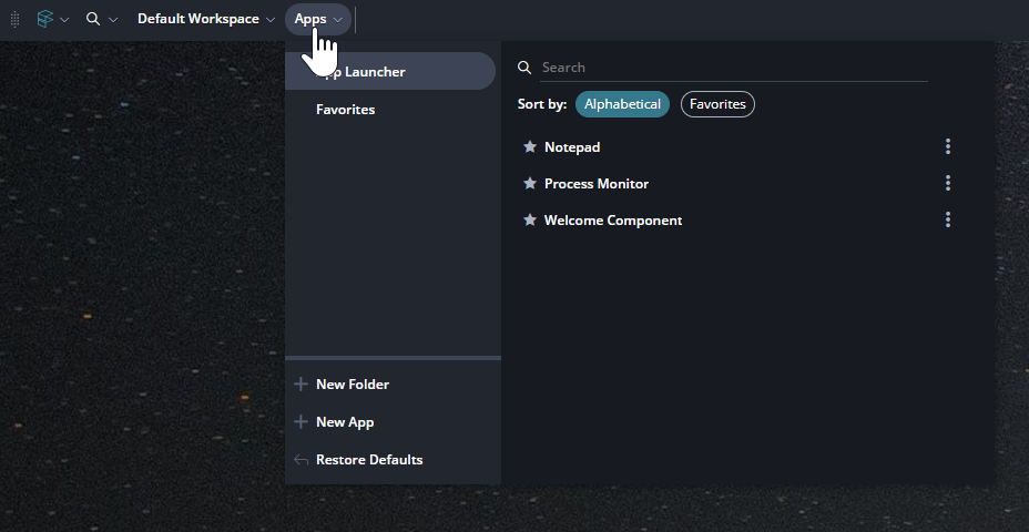
Here is a screenshot of the <AdvancedAppLauncherMenu>:
The <AdvancedAppLauncherMenu> supports "Quick Components". Like <AppLauncher> it display components only if they
have the config property ['foreign']['App Launcher']['launchableByUser'] set to true.
<AdvancedAppLauncherMenu>is available in the Finsemble "Flow" package. To learn more about Finsemble Flow see: Advanced Packages.
<AdvancedAppLauncherMenu> accepts the props customURLValidation, beforeAddComponent and customAddComponent all
of which apply to the quick component form.
If customURLValidation is provided, when a user tries to create a quick component the url for the component will be
validated using the provided function instead of the built-in validation. If the value passed is not a function the
validation will fall back to the default so that it can still proceed. Additionally, if the first value of the return
type [boolean, string] is not a boolean, the validation will also fall back to the default. The second value of type
string in the return value will be displayed on the form as an error message in the case where the boolean returned is
false.
If beforeAddComponent is provided, this function will be used after validation and before adding the component to
Finsemble, allowing for modification of the data before passing it on to the add function.
If customAddComponent is provided, this function will be used instead of the default add component function, allowing
you to customize
The <AdvancedAppLauncherMenu> component can be used from the toolbar like so:
<ToolbarShell>
	...
	<ToolbarSection className="left">
		...
		<AdvancedAppLauncherMenu />
	</ToolbarSection>
	...
</ToolbarShell>
Example customURLValidation function:
const customURLValidation = (url: string): [boolean, string] => {
	// Response indicating an invalid url with a custom message
	return [false, "Please try again"];
};
Example beforeAddComponent function:
const beforeAddComponent = (formData: any): object => {
	formData.url = formData.url + "?customParams";
	// Modified form data will be used when creating the component
	return formData;
};
Example customAddComponent function:
const customAddComponent = (formData: any, callback: Function) => {
	// Add Custom logic here
	// Add the component to Finsemble
	FSBL.Clients.LauncherClient.addUserDefinedComponent(formData, (error: any) => {
		// Be sure to call the callback to indicate to the form the operation has completed
		callback(error);
		return;
	});
};