Toolbar Component
The toolbar component is the hub of the SmartDesktop, allowing users to quickly and easily launch applications, search their data, and manage workspaces with the click of a button or the press of a hotkey. The toolbar is independent of any workspace, keeping this functionality always available to the user.
The toolbar is highly customizable. In the rest of this document, we'll cover its default structure as well as its customization points, including menuing and favorites.
High-level Structure
You can see the default toolbar layout on Github.
The main functionality of the toolbar is provided by the ToolbarShell component, which handles low-level communctation with the rest of the SmartDesktop. The contents of the ToolbarShell are divided into three sections, controlled by the class names left, center, and right respectively. You are free to add or remove child components from any section, or remove sections themselves.
By default the toolbar includes the controls listed in the table below.
API
The Toolbar uses the following React components from the Finsemble UI API library.
| Control | Summary |
|---|---|
| AdvancedAppLauncher | An advanced app launcher with folders and tags |
| AppLauncher | A simple pull down menu for launching apps |
| AutoArrange | A button for automatically arranging windows on the screen |
| DragHandle | The "draggable area" on the toolbar to move it around the screen |
| FavoritesShell | A section to display, launch, rearrange or remove favorites |
| MinimizeAll | A button that minimizes all Finsemble windows |
| RevealAll | A button that restores all Finsemble windows |
| Search | A drop down menu for federalized search across SearchProviders |
| ToolbarShell | A wrapper for the toolbar. All toolbar components must be contained in the ToolbarShell |
| ToolbarSection | A container section that intelligently resizes depending on the length of the toolbar |
| WorkspaceManagementMenu | A drop down for launching and managing workspaces |
App Launcher and Advanced App Launcher
The app launcher component is a menu accessible from the toolbar that allows users to launch and favorite components.
The advanced app launcher component provides a richer end user experience than default app launcher. It is designed for use cases involving a large number of applications, with features for searching and organizing apps. Features include:
- Bookmarks
- Search and filtering
- Folders and organization
Both components are implemented as buttons that can simply be added to the toolbar template.
File Menu
The file menu is included in the seed project for easy customization (see it here on Github). The file menu is simply an instance of the Menu Component - you can refer the menuing section for more details.
The file menu has several several pre-built controls (listed in the table below) which may be removed or rearranged. Additionally you can add your own items - here's a quick example:
...
<Preferences />
<MenuItem onClick={() => alert("Hello world!")}>
    My Custom Menu Item
</MenuItemm>
<SystemLog />
...
API
The File Menu uses the following React components from the Finsemble UI API library.
| Control | Summary |
|---|---|
| Preferences | An menu item that opens the Preferences window. |
| SystemLog | A menu item that opens the system log. |
| CentralLogger | A menu item that opens the central logger. |
| Documentation | A menu that opens this documentation site. |
| Restart | A menu item that restarts the SmartDesktop. |
| Reset | A menu item that resets the SmartDesktop to its initial state, destroying all workspaces, custom apps, etc (use with caution!). |
| Quit | A menu item that quits the SmartDesktop. |
Favorites
"Favorites" are buttons on the toolbar that let users launch their favorite workspaces or apps without having to dig through menus. They work much like bookmarks in a browser or "pinned" items in applicatons like Slack. Favorites are implemented with two components. FavoritesShell is the area on the toolbar that contains the favorites. FavoriteMaker is a component that lets users toggle a favorite on and off (the "star" that they press). FavoriteMaker is usally found in menus.
API
Favorites use the following React components from the Finsemble UI API library.
| Control | Summary |
|---|---|
| FavoriteMaker | A "star" icon that toggles a favorite on and off |
| FavoritesShell | A container for favorites where users can launch and organize their favorites |
Menuing
Drop down menus, such as those in the toolbar, exist in windows that are created and destroyed on the fly. Menu positioning is intelligent, appearing upward or downward depending on their location on the screen. Finsemble's menus emulate the desktop menu experience but are built with HTML5 and React. This gives you the power to put anything in a menu!
Behind the scenes, menus use React Portals to manage state across window borders and Finsemble's windowing primatives to manage location but you don't need to deal with any of that to create your own menu. Constructing a menu in Finsemble is as easy as creating a drop-down in DOM. Just use the following React components.
API
Menuing uses the following React components from the Finsemble UI API library.
| Control | Summary |
|---|---|
| Menu | A component that creates a fully functioning drop down menu. |
| MenuContent | Advanced. The actual drop-down menu. All contents inside <MenuContent> will be displayed to the user |
| MenuToggle | Advanced. A button that opens and closes the menu. |
| MenuItem | Optional. A container that can be used within a menu. This allows cursor up/down navigation and can automatically close the menu on clicks. |
| MenuShell | Advanced. Provides a shell for the menuing mechanism. It creates and registers a menu {i.e. with the toolbar)}. |
Creating Menus
<Menu id="MyMenuId" title="ClickMe">
    <div>Optional Title</div>
    <MenuItem>item #1</MenuItem>
    <MenuItem>item #2</MenuItem>
    <MenuItem>item #3</MenuItem>
    <div className="custom-div">You can put anything you want in a menu</div>
</Menu>
Advanced Menus
Sometimes you may need to create a complex menu. You can use the advanced components to gain finer control over menuing.
Here's how the menuing React components collaborate to create a drop-down menu:
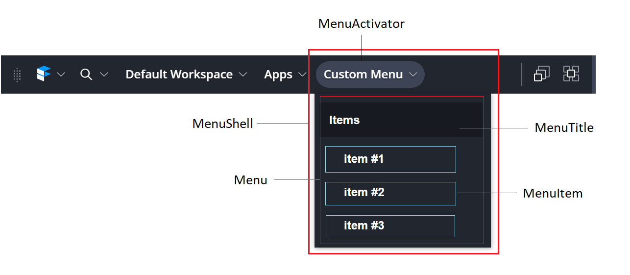
Here is sample code for creating a menu using internal components:
<MenuShell id="MyMenuId">
    <MenuToggle>Custom Menu<MenuToggle/>
    <MenuContent>
        <div>Optional Title</div>
        <MenuItem>item #1</MenuItem>
        <MenuItem>item #2</MenuItem>
        <MenuItem>item #3</MenuItem>
        <div>You can put anything you want in a menu</div>
    </MenuContent>
</MenuShell>
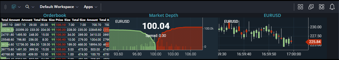
Dashbar
The Toolbar features an additional (and optional) bar below it that can house and display web pages/web apps in real-time. The Dashbar items are implemented using BrowserViews and can be organized to appear in any order the user desires. The views can also be given custom widths. The Finsemble API is accessible to the pages loaded within the Dashbar item, and files preloaded into the Toolbar also get preloaded into the views.
Below is an example of what the dashbar can look like:
To configure dashbar, first define your dashbar items in the seed config file dashbarConfig.json. Each item must have a title and a url and you can optionally include a width/height which will prevent the dashbar item from being wider or taller then the specified pixel value.
Heights greater then the dashbar height (information below) will not extend the height of the toolbar, and will be cut off from view unless the dashbar height is adjusted.
You can also add disablePointerEvents to disable the ability to interact with items inside the dashbar.
"finsemble": {
    "availableDashbarItems": {
        "stockWidget": {
            "title": "Stock Ticker",
            "url": "https://example.stock.ticker.com",
            "width": 200,
            "height": 200
        }
    }
}
The list of items defined in the dashbarConfig.json will be the items available for a user to add to their dashbar. Defining them here only creates them as options, and does not add them to the dashbar.
In the component config for the toolbar, define the dashbar properties (height of the dashbar, the widget divider width, and which items (by key) should be automatically added to the dashbar):
"window": {
    "data": {
        "dashbar": {
            "height": 150,
            "widgetDividerWidth": 1,
            "items": ["stockWidget"]
        }
    }
}
Both the height and widgetDividerWidth are expressed in pixels and if you do not wish to have a divider you can either not add the widgetDividerwidth or set it to 0.
The max height of the toolbar will be the calculation of component height + dashbar height. You must define a dashbar height for it to show. If dashbar height is not defined, the dashbar will not show regardless of what items are defined.
To change the items the dashbar is displaying, open the preferences component and navigate to the Dashbar section: 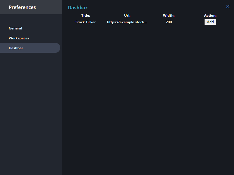
From here, users can activate/deactivate dashbar items defined in the manifest and the dashbar will update its display accordingly.