 Legacy version 6 documentation. View current documentation.Legacy version 6 documentation. View current documentation.
The <Icon> component creates a visual icon to represent applications, workspaces or other items. An icon can be
created from a font, an image url or from text.
Here's a screenshot: 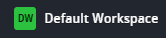
| Name | Type | Required | Description |
|---|---|---|---|
| imageType | { type?: "fonticon" | "url" | "initials", path?: string } | No | Defaults "initials" which creates an icon from the "name". "fonticon" displays a font where path must be a font-finance icon className such as "ff-arrow-left" or "ff-workspace"; when set to "url", the path should be set to the url of an icon image. |
| path | string | no | The path for the image if imageType is "url" or "fonticon". |
| name | string | no | The display name associated with the icon. |
| category | "Workspace" | "Application" | no | The category of the component associated with the icon. |
The attribute data-category will be set with the value of the prop "category". This can be used to customize the
appearance when imageType is "initials".
    <div>
        <Icon imageType="initials" name="My Blotter" category="Application" />
    </div>
});